UX research for sports booking software

Client

TheQuickSport

Deliverables

UX research

Keywords

Project Exploration, Support

The challenge

A client, TheQuickSport, offering a Sports Booking Software, approached us intending to improve the overall user experience of their website. The platform allows users to sign up and book sessions for a variety of sports, including football, volleyball, and basketball. While the service itself was functional, the client had received feedback that the site was confusing at times and lacked a clear structure. They asked us to evaluate the website and provide a comprehensive overview of how the user experience could be improved. Our focus areas included visual consistency, textual clarity, interface controls, and navigation flow.


Close-up of two people sketching a website wireframe and user interface design with red, green, and black markers on a whiteboard, illustrating a collaborative UI/UX design planning session.

The solution

We delivered a design advisory document that outlined key recommendations based on a thorough user experience audit. To understand how users interacted with the platform, we created detailed user journey scenarios by mapping out typical paths a person would take to register, find a sport, and complete a booking. This process helped us identify moments where users experienced confusion, dropped off, or encountered friction points.

Een van de eerste problemen die we zagen was een gebrek aan visuele consistentie. Lettertypen, kleuren en beeldgebruik verschilden tussen pagina’s en sociale media, wat een versnipperde ervaring opleverde. We adviseerden een uniform designsysteem om visuele samenhang te behouden en de merkperceptie te verbeteren. Tegelijkertijd evalueerden we de teksten op de website en vonden we inconsistenties in toon, terminologie en benaming van bedieningselementen. Ook de navigatie vormde een uitdaging. Sommige bedieningselementen stonden op inconsistente plekken of waren onduidelijk gelabeld, waardoor gebruikers op doodlopende paden terechtkwamen of foutpagina’s zagen zonder context of instructies. We adviseerden betere foutmeldingen en fallback-states, zoals suggesties of hulpprompts, om gebruikers te begeleiden wanneer er iets misgaat.

Door visuele aanbevelingen te combineren met structurele inzichten boden we de klant een strategische basis om de bruikbaarheid te verbeteren en vertrouwen bij gebruikers op te bouwen. Het doel was niet om de website opnieuw uit te vinden, maar om de ervaring te verfijnen en te versterken door frictie aan te pakken, de designtaal op elkaar af te stemmen en de volledige gebruikersreis intuïtief te maken.

Screenshot from the UI/UX report prepared for the quick sport explaining that multiple rows of centered text are more difficult to read than, text that is aligned to the right
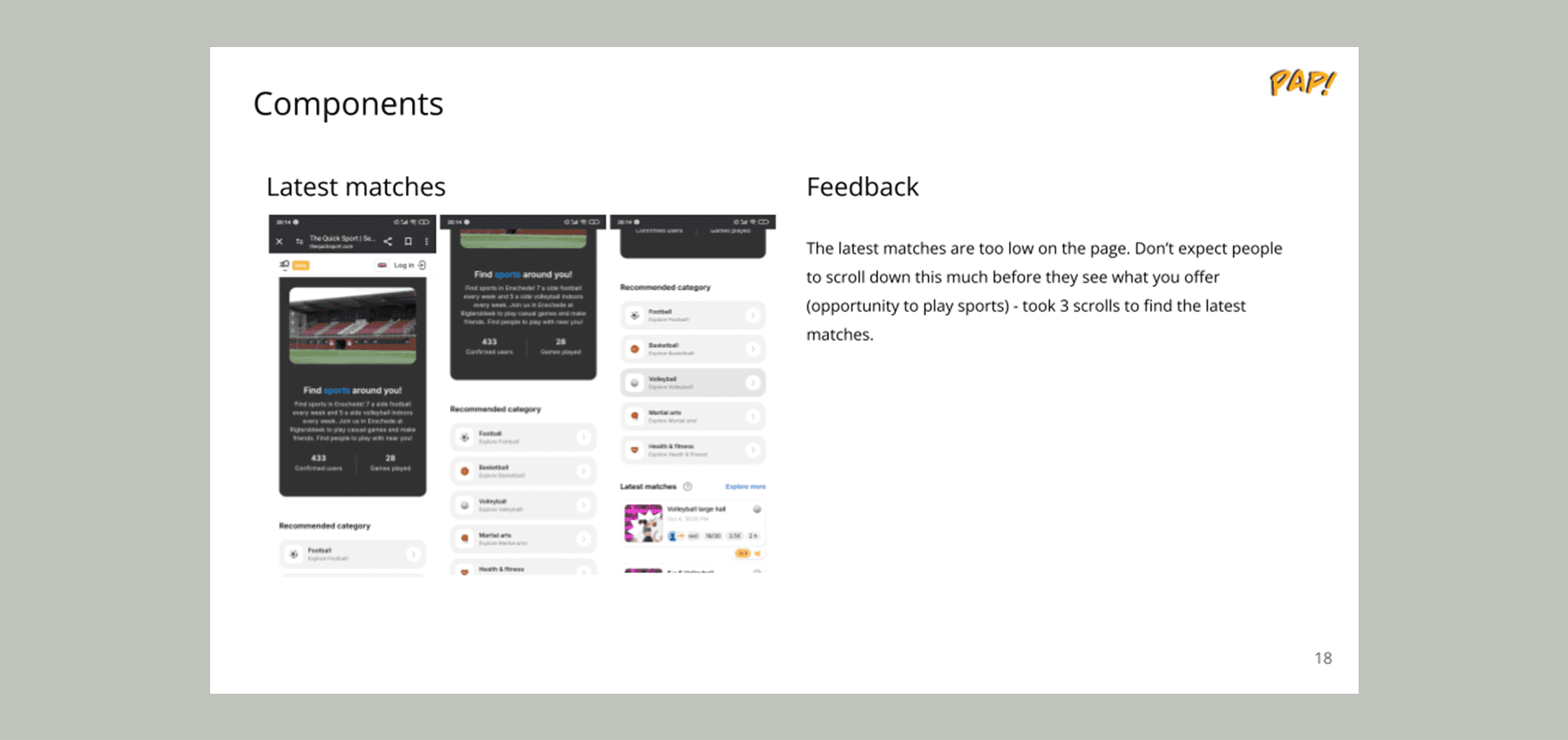
Screenshot from the UI/UX report prepared for the quick sport explaining that it is unreasonable to expect the user to scroll three times before being able to interact with their service.