Onboarding folder
Klant
NullSpace
Deliverables
Onboarding folder
Keywords
Project Exploration, Ideation, Concept Development, Support

The solution
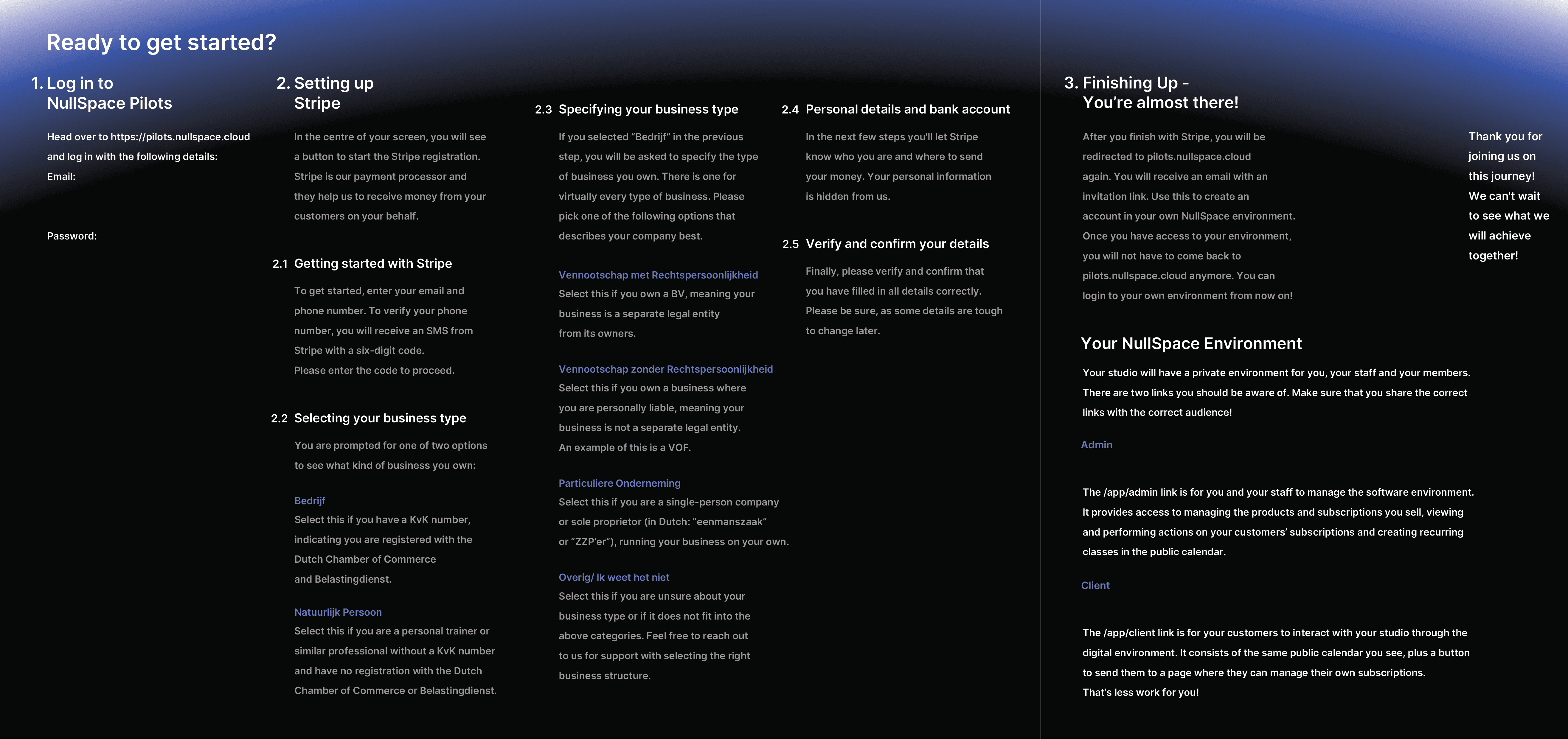
Since the folder contains a large amount of information, it can easily feel overwhelming. Various techniques were used to improve readability and make the content more digestible and user-friendly. First, the information was grouped into chunks. Thus, there is a chunk for explaining what the folder is about and what company it is related to, a chunk related to asking for assistance in case of technical difficulties, one where the main steps the user needs to take are presented, and a chunk for the wrap-up section.
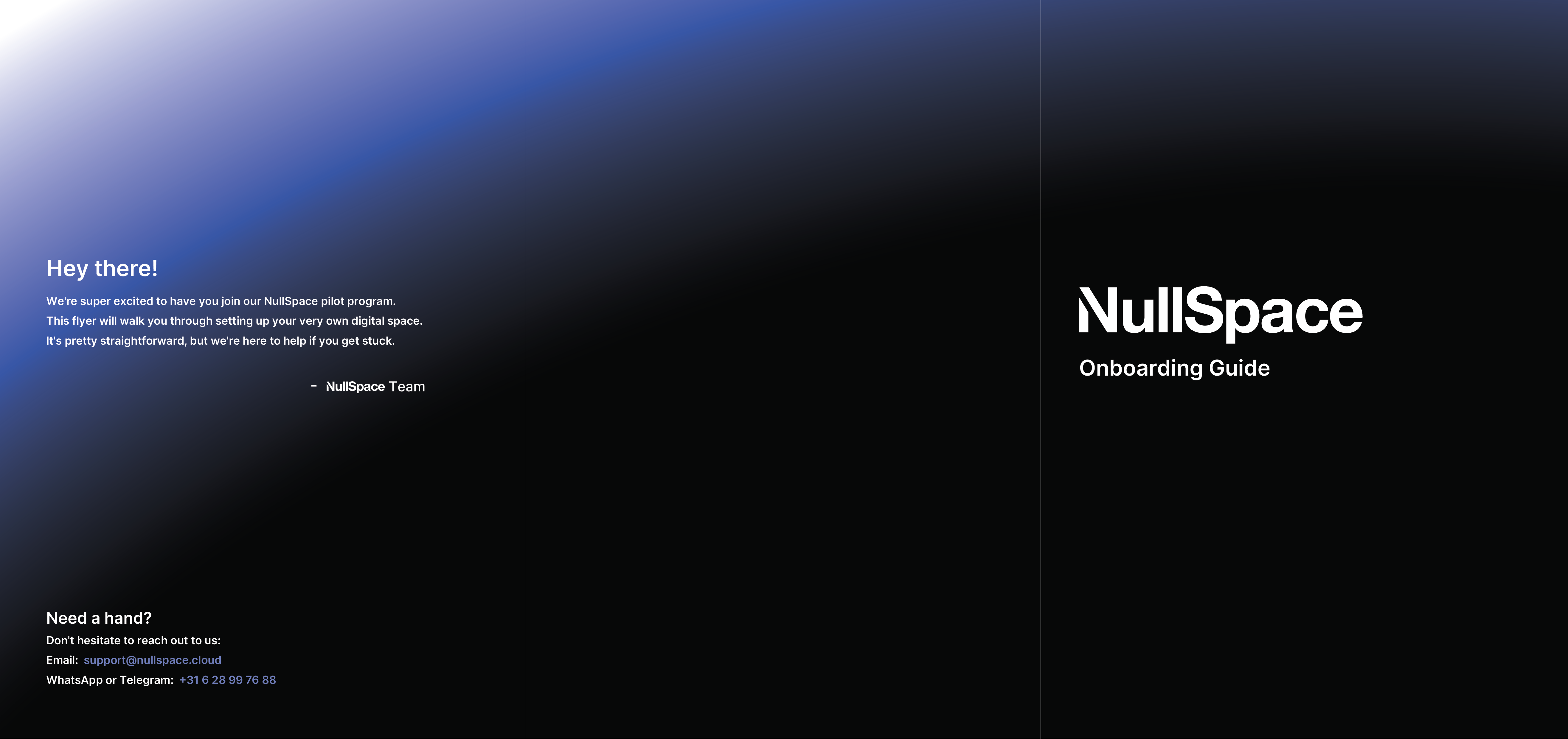
Since the medium in which the information is presented is a folder, the text had to be organised on the item clearly and intuitively. Hence, when the user looks at the folder, the first information they notice is the name of the Company and the function of the folder. The first page of the folder opens from right to left, meaning that the next information the users see is the "welcome" message from the company and at the bottom of the page, information about what to do in case they need help. Once the folder is fully opened, the user has an overview of the steps they need to take to achieve a successful onboarding. The headings of these steps were made to stand out, to make them easier to follow, while the text was dimmed to not overwhelm the user. On the last inside page of the folder, the wrap-up section explains how to access their new software, which was left bright, because it is an important moment for the user, where it is confirmed whether they followed the steps correctly or not. Lastly, there is a "thank you" message from the company to indicate the end of the onboarding process.