Bubble tea poster
Client
Frosty's Pokébowl
Deliverables
Promotional poster
Keywords
Project Exploration, Ideation, Concept Development, Support

The solution
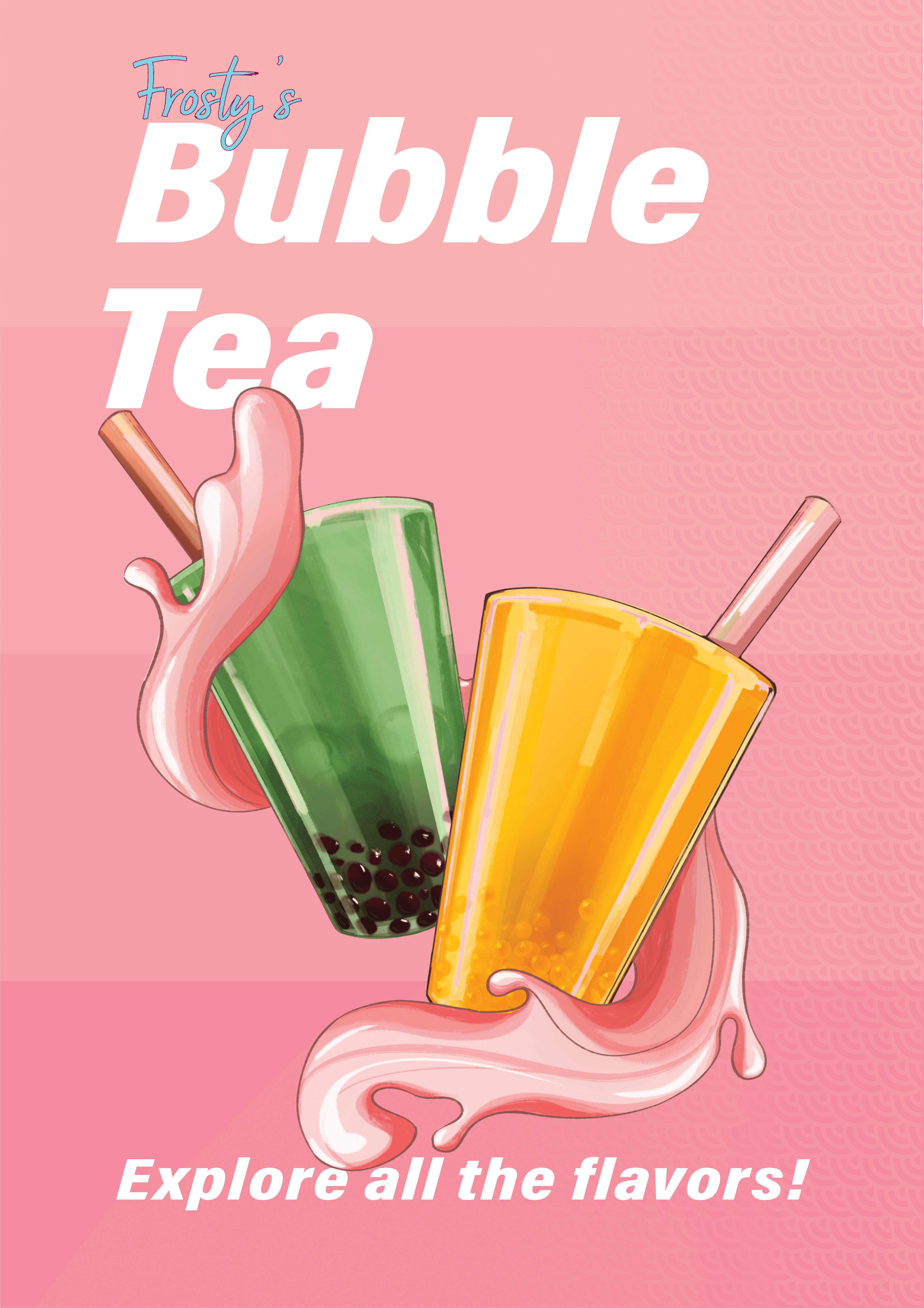
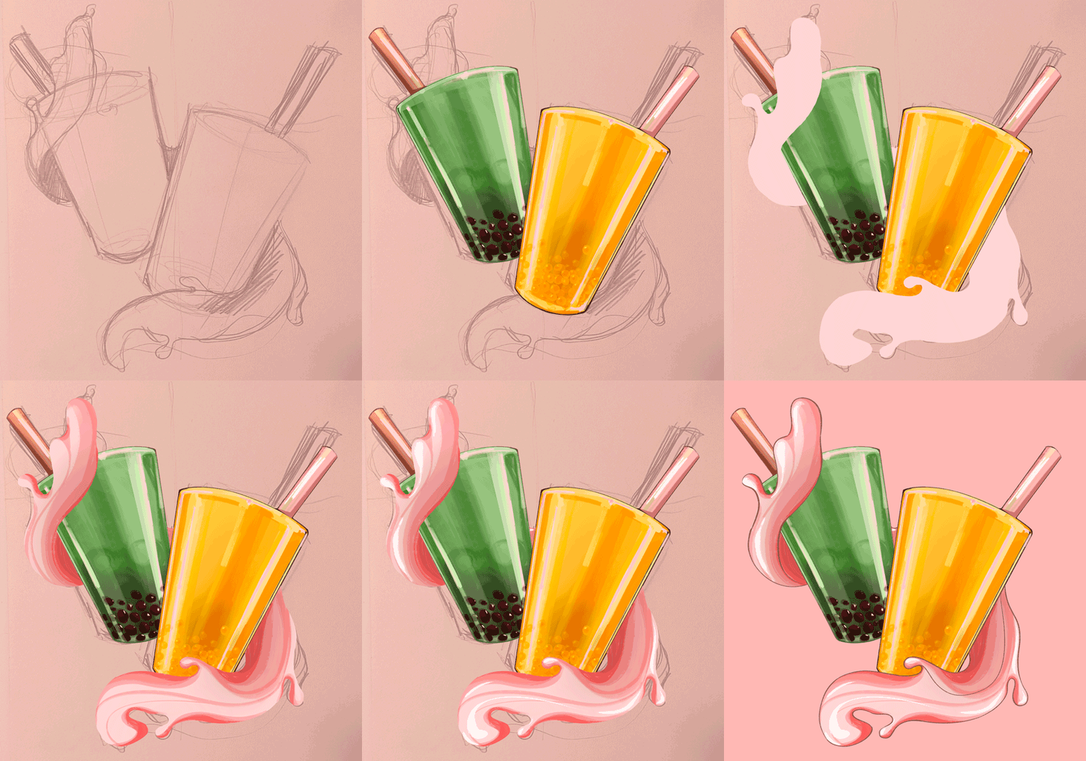
We designed an A4 poster that focused on bold visuals, limited text, and a clear message: bubble tea is now available at Frosty’s. The layout was structured to work at a glance, with the most essential information placed at the top, "Bubble Tea", and at the bottom, "Explore all the flavours!". The clear message is meant to be in line with Frosty's branding. Two illustrated bubble tea cups were placed at the centre, featuring layered colours and realistic textures to evoke freshness and flavour. The colour scheme builds on the palette introduced in the step-by-step menu, using mint green and lemon colours for the bubble tea cups, and the signature pink gradient and fish scale pattern that are present in all Frosty's menus. To create a sense of movement and freshness, the cups are held by two streams of flowing liquid, guiding the viewer’s eye and adding a dynamic feel. This is further complemented by the italic text.
Overall, the outdoor poster maintains a strong visual connection to Frosty’s existing identity while being designed specifically to function in a high-traffic, fast-paced setting. It communicates the new product offering instantly, draws attention through colour and composition, and invites both new and returning customers to step inside and give bubble tea a try.